Creative
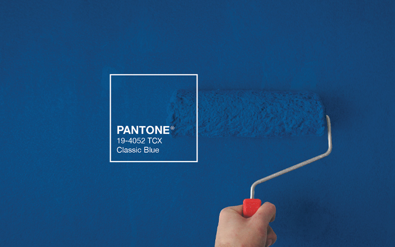
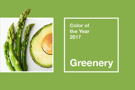
For more than two decades, the Pantone Color Institute has annually selected a Color of the Year, which emerges from exhaustive trend analysis and careful consideration of color influences from all over the world. But Pantone’s color experts determined that a single color wasn’t enough after the events of the past 10 to 12 months. There had to be TWO (marking just the second time that’s happened, joining 2016’s Rose Quartz and Serenity).
The chosen colors are a sort of yin and yang — opposite yet complementary.
Ultimate Gray (PANTONE 17-5104) acknowledges the shades of gray that define our collective experience in this unprecedented moment. And yet, its middle-of-the-hue shade represents strength and fortitude.
Meanwhile, the sunny yellow of Illuminating (PANTONE 13-0647) is happy and bright — a metaphor for the light we hope to find at the end of the tunnel.
The Institute referenced the importance of connections as one driver for this year’s choice. For me, the combination of gray and yellow doesn’t immediately make me think of connections, since the two don’t make a new color when mixed together. The yin and yang contrast could suggest a sort of connection, but I think it’s a bit of a stretch.
As with any trend, brands should be deliberate and thoughtful about how they adopt any fleeting fads, and the Color of the Year selection(s) certainly falls into that category. However, social media channels can be the perfect place to incorporate these colors in order to infuse some much-needed optimism, resilience and positivity for consumers.
It’s worth noting this color combination has been around a long time, so it’s already out there. I’ve seen it used in fashion, architecture, interior design, graphic design and housewares (in the last case, more individually than as a duo).
What else should brands keep in mind when using these colors?
Yellow and gray have been a popular color combination off and on throughout the years. One thing to remember is that the gray tempers the yellow. Yellow can be overpowering when overused, but it’s a powerful color when contrasted with gray.
Another suggestion: Pair these colors with other neutrals such as cream, white, black or wood tones.
Can the second two-color choice for Pantone Color of the Year be more successful than the first?
In 2016, the pairing of Rose Quartz and Serenity struck me as a strange choice. I don’t believe the Pantone Color Institute explained the selection well or, for that matter, stood behind its true meaning. Instead of putting a stake in the ground, they took a noncommittal, beat-around-the-bush approach. This diluted their message. In fact, the two colors were not actually adopted until a year after the selection — and by that time, the world had already moved on to a new Color of the Year for 2017.
The moral of this story? The strategy of selecting two colors is intriguing, but the concept’s launch, in 2016 at least, fell short of the mark. Only time will tell if Ultimate Gray and Illuminating can be more successful.