Creative
Industry Trends
In design, there are few things that are more subjective — or more important — than the use of color. Maybe that’s why, every December, the Pantone Color of the Year announcement is such a hot topic.
But will Ultra Violet take the world by storm? Before you start seeing purple, here are seven things to consider:
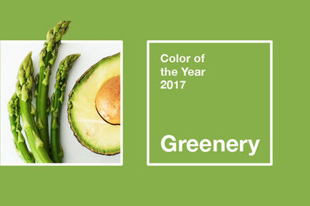
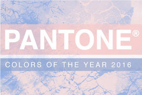
- Pantone Color of the Year selections can influence design only as far as the colors themselves can go. Popularity doesn’t come standard with Color of the Year recognition. For example, the 2016 colors of Rose Quartz and Serenity (mostly the pink versus the pale blue) were a lot more popular than the 2017 color, Greenery. This may be due to the fact that Rose Quartz was already out there in a big way and simply gained momentum when Pantone made it a co-Color of the Year. It’s also much easier to incorporate pink or pale blue into design than it is to infuse your work with an uber-bright color like Greenery or Ultra Violet. With that said, many designers take liberties with Colors of the Year by selecting shades in the same family. Remember, you don’t have to use the exact Pantone color to be on trend, and using different shades and purple hues should actually help Ultra Violet succeed as a Color of the Year.
- Still, get ready for a deluge of purple products. Pantone claims that the Ultra Violet color is already being put to use by a range of technology companies and other innovative businesses. Whether or not that’s true, get ready for a deluge of purple products across the board, from branding to home décor to fashion — either marketed as such or developed just because of Pantone’s Color of the Year announcement.
- Purple is the most complex of all colors. Pantone Executive Director Leatrice Eiseman said purple is the most complex of all colors, and I have to agree. Purple is an intriguing mix of passionate red and reliable blue and the balance between these two primary colors. And, because purple is created by combining a strong warm with a strong cool color, it retains both warm and cool properties. Not a lot of colors can do this.
- We don’t always view colors the same way as our neighbor. Personally, I don’t love purple — at least, it’s not my go-to color. (It reminds me too much of Barney.) But that doesn’t mean the 2018 Color of the Year will fall flat. Remember: a color that evokes a certain reaction in one person may evoke the opposite reaction in the next person. Cultural differences, prior associations and even personal preferences all have a profound impact on the way we see colors.
- Don’t force Ultra Violet onto your brand. Don’t worry too much about using any Color of the Year unless you have a client that needs to show how it stays on top of trends. Does awareness of color forecasts help brand marketers stay relevant? Yes. But you should never, ever force a color into your palette just because it’s the Pantone Color of the Year.
- A little color goes a long way. Like its predecessor, Greenery, Ultra Violet is another difficult-to-design-with color. It must be masterfully utilized in order to look sophisticated. If you do decide to use the 2018 Color of the Year, remember that a little color (especially this one) goes a long way. Ultra Violet is full of richness, and it can be a powerful color. Used well, it can have a calming or uplifting effect or even trigger creativity. But use this bold color carefully and in small amounts so as not to overpower or overstimulate people. Employ it as an accent color or soften it with other purples, pinks and blues. By incorporating other shades in the same color family, you can soften the boldness of Ultra Violet and make it feel more sophisticated.
- The Pantone Color of the Year isn’t going to change the world order. The Pantone Color Institute hopes Ultra Violet can send a message of harmony, something we could all probably use these days. But I think the themes behind the Color of the Year selections are really lofty — though a clever marketing ploy. While Ultra Violet won’t influence politics or achieve world peace, I think Pantone’s color selections are timely and create additional relevancy for their own global promotion of color trends. It’s a smart tactic that seems to be working for them.
The good news? Purple can be easily manipulated through shade adjustments and color combinations to make it look gorgeous. And while it isn’t for everyone, a touch of Ultra Violet might just be exactly what your brand needs in 2018.