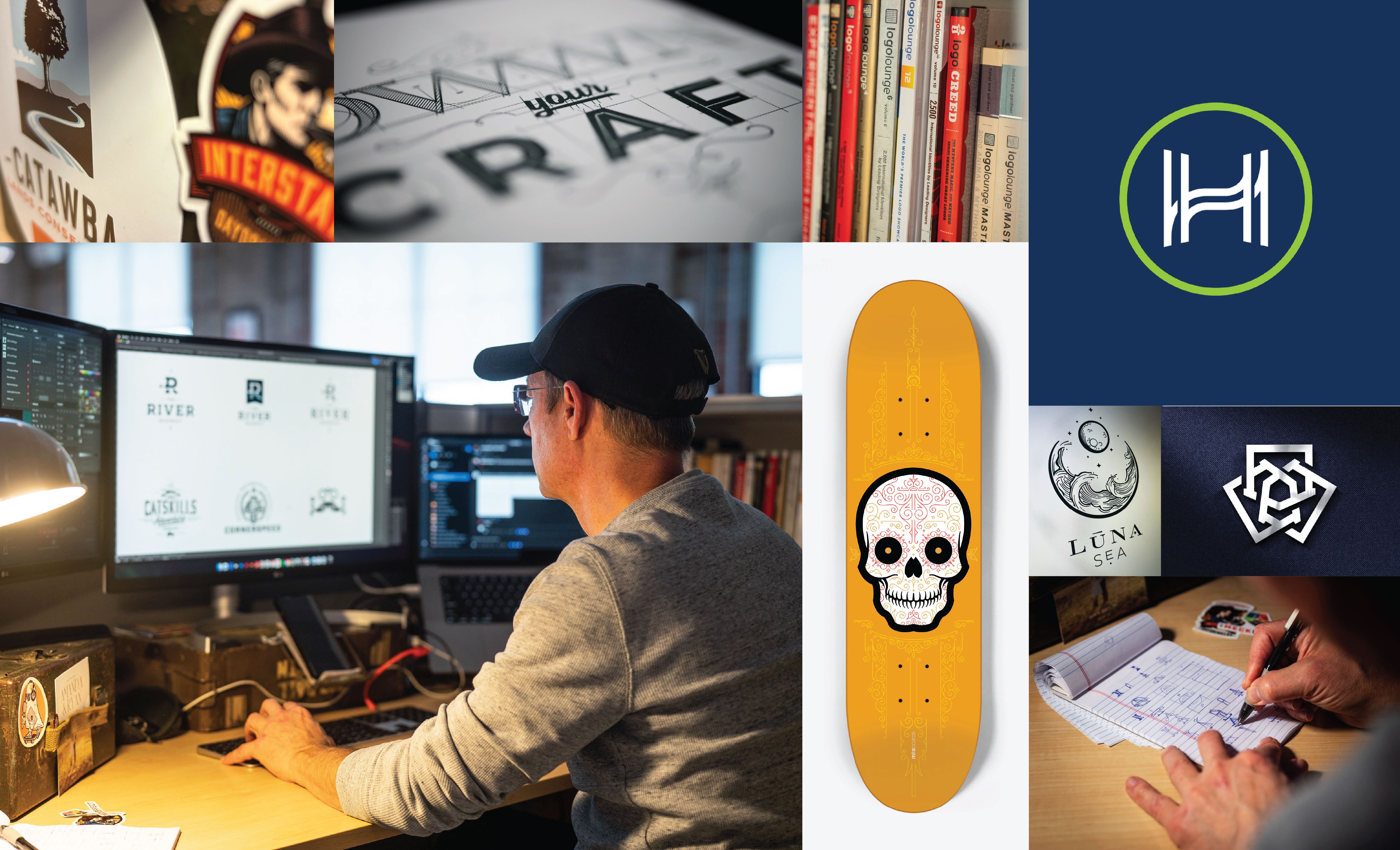
Creative
With anticipation akin to the crowds in Rome waiting for white smoke to arise from the Vatican signaling a new Pope, each year many in the design world eagerly await Pantone's "Color of the Year” announcement. The 2015 Pantone Color of the Year is (drumroll please) Marsala, also known as PANTONE 18-1438.
Personally, I’ve always thought of Marsala as a brownish wine that I use to make a brownish sauce. But the folks at the Pantone Color Institute offer a more ornate description:
"A naturally robust and earthy wine red, Marsala enriches our minds, bodies and souls. The impactful, full-bodied qualities of Marsala make for an elegant, grounded statement color when used on its own or as a strong accent to many other colors."
I have mixed emotions on this "color of the year” concept. I think Marsala is a rich, beautiful color. However, I don’t recommend that any creative team heedlessly follow a color announcement or begin adding the color to everything. As creatives, we must strive to catch people off guard with bold, surprising ideas and “original" thinking. Our goal should never be to simply jump on the trend bandwagon and “blend in.”
With that said, the design world is a vast place, and it provides plenty of smart places to incorporate on-trend colors. Designers and stylists HAVE to be aware of the colors du jour and know how to use them if they want to connect with and be relevant to their audiences.
How does Pantone select the color of the year? Do they randomly pick an underutilized color just to mix things up? Do they have a clairvoyant wizard on staff to gaze 12 months into the artsy future? No. Could it be that Pantone’s Color of the Year announcement is less a prediction than a statement about where society’s trends are headed?
To put this theory to the test, I picked up a variety of design magazines and shelter pubs from the last six months. Guess what I found? Yep, LOTS of Marsala. In one issue of Dwell magazine, I counted 37 instances of Marsala or Marsala-like colors. Marsala was everywhere—featured spaces, advertising and even the accessories and new products sections.
So, depending on what it is that you create, you may want to incorporate this intense color in your work. But proceed thoughtfully. Come to think of it, I liken Marsala more to tequila than wine; in measured doses, it can be fantastic—but overdoing it might make us all sick.