What can brands learn from Pantone’s 2022 Color of the Year?

  • Categories:

    Creative, Industry Trends

  • Date:

    January 12, 2022

What can brands learn from Pantone’s 2022 Color of the Year?


Creative Industry Trends

Every year since 2000, the color experts at Pantone® have combed through the company’s vast array of palettes to determine which hue should become its next Color of the Year.

The epitome of all things trendy in the paint world, Pantone’s Color of the Year selection draws upon color influences from across the globe, including fashion, art, technology and socioeconomic conditions. However, heading into 2022, Pantone did something it had never done before: It created a brand-new hue to don the Color of the Year crown. And so, PANTONE 17-3938 Very Peri was born.

A New Color for a Fresh Start

Pantone describes Very Peri as a “new color whose courageous presence encourages personal inventiveness and creativity.”

Traditionally, periwinkle is a muted, understated tone, evocative of friendship, fond memories and innocence. However, Pantone’s unique version isn’t a pastel, and it certainly isn’t understated. Instead, it’s electric, infused with bright, vivid blue tones and a hint of purple.

In essence, Pantone’s Very Peri isn’t a periwinkle at all.

A traditional periwinkle has many of the same associations as most light blue tints, such as freshness, cleanliness and tranquility. But Pantone’s Very Peri leans closer to indigo, opening up the shade to more possibilities for interpretation.

Perhaps this broad-mindedness is why Pantone is encouraging creativity and inventiveness. According to Pantone, Very Peri promises to bring “newness” to the year ahead. This sentiment falls in line nicely with much of the population’s 2022 goals, especially after an intense two years defined by a life-altering pandemic.

No one knows exactly what 2022 will bring, but it’s safe to say we could all use a fresh start.

Where will you find Very Peri?

Throughout 2022, I think you’ll see adoption of Very Peri in a handful of industries, from fashion and beauty to home decor and design.

  • Architects and designers may use the color in lighting concepts to highlight Very Peri’s impact.

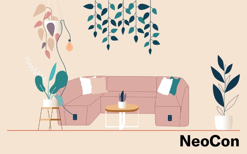
  • Residential interior designers may adopt Very Peri on walls, ceilings, floors, furniture, accessories or windows.

One thing I found interesting throughout Pantone’s Color of the Year announcement is the company’s association of Very Peri with the continuous merging of the physical and digital worlds.

“With trends in gaming, the expanding popularity of the metaverse and rising artistic community in the digital space … Very Peri illustrates the fusion of modern life and how color trends in the digital world are being manifested in the physical world and vice versa.”

I believe this association was an intentional marketing move on behalf of Pantone. Choosing a shade that evokes the familiar blue glow of our digital devices at a time when online spaces are becoming increasingly commonplace is a clear example of a brand seizing an opportunity to stay relevant.

Tips for Brand Execution

If your brand is looking for ways to incorporate Very Peri into products and marketing materials, keep the following in mind.

  • In the digital world, it’s easy to go bold with Very Peri, since technology, by its very nature, encourages experimentation.

  • In the physical world, however, an excessive amount of the color could quickly become overwhelming. Once you go bold on your walls, for example, reversing the effect isn’t as simple as making a few clicks.

Instead, I suggest using the color as an accent or pairing it with other complementary colors. The classic blue in the periwinkle expands these options, leaving endless possibilities to incorporate Very Peri into your brand designs.

Try these tips:

  • Combine periwinkle with bright hues to create a spirited feeling, or use it to complement blues and neutrals for a more serene feel.

  • Use analogous colors (next to each other on the color wheel) to create a striking look, physically or digitally.

  • Combine various shades of blue-purples and purple with a hint of red to animate any design.

Looking Back, Looking Forward

Color resonates with different people in different ways. With any Color of the Year selection, a primary goal involves answering the question, What do people want to surround themselves with this year?

For 2022, other paint companies gravitated toward soothing naturals for their selections, such as pale greens and muted sages. Many of these colors replicate the soothing effects of nature and biophilic design — two of the top interior design trends this year. On the other hand, Pantone wants to immerse us in a brighter, uplifting color.

After the unprecedented events of 2020, Pantone’s two 2021 Colors of the Year, Ultimate Gray and Illuminating, represented quiet reassurance and resilience in the face of difficult circumstances, as well as optimism for the future. In turn, Very Peri symbolizes the changes the world is experiencing as we look to move beyond the isolation and uncertainty of the pandemic.

I find it interesting that Pantone went in an opposite direction from its selection last year. Of course, Pantone is a business and, like every business, is trying to stay relevant for its audience and ahead of the competition by being unique. I believe it created a concept — and invented a color around that concept — because a standard color simply wasn’t different enough.

I’ll leave you with this: Does Very Peri naturally inspire innovation and creativity, or does Pantone, by inventing a color to don its 2022 Color of the Year crown, give the selection deeper meaning?

I’ll return in December to reflect on Very Peri’s adoption throughout 2022 … and to determine whether Pantone nailed this year’s zeitgeist with its purple-blue hue.

Only time will tell.

Explore more articles from Wray Ward.