Creative
Industry Trends
Inspiration

Written By
Liz Foster
Content Marketing Senior Manager
As we eagerly await Pantone’s 2027 color of the year, we polled our talented Wray Ward designers about what they thought might be this year’s top hue.
After Cloud Dancer (a calm, neutral white) for 2026, all of the designers hope the selection is an actual shade and not a mix of all visible wavelengths. Answers ranged across the (color) spectrum, with guesses rooted in what’s hot in fashion and home trends as well as nostalgia and desire for simplicity.
Here’s what they said:
A Return to the Earth (Tones)
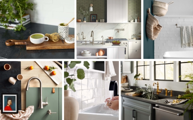
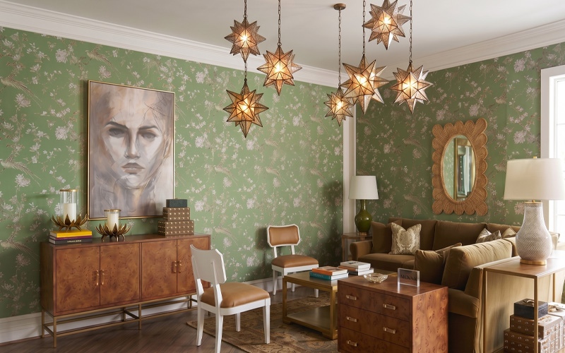
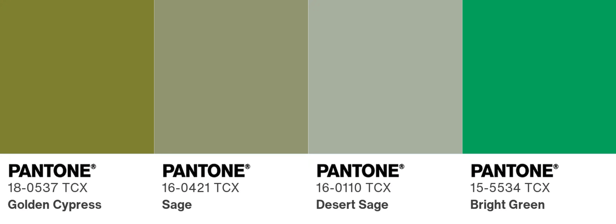
Designer Kelly Gilbert believes this year’s color will reflect a cultural desire to return to tradition, such as a muted olive, especially in this age of AI proliferation.
“I get the sense that people are overwhelmed by the noise in the digital space and are nostalgic about culture and aesthetics from the past,” she said. “Online and in the media we’ve seen a renewed interest in jewel tones, antique furniture, secondhand shopping and analog hobbies, all hinting at a yearning for a slower pace of life.”
Associate Creative Director David Adams agrees, saying he thinks the
selection will be deeply grounded and earthy — between a soft sage and a rich olive.
“This earthy green acts as an organic antidote to the screen, pulling us back to the tactile beauty of handmade crafts, the resilience of nature and the permanence of the Earth,” he said. “It offers stability within a fast-moving technological world, serving as a subconscious signal of growth, balance and renewal.”
In fashion, this green is either a sophisticated shade for a classy touch or utilitarian shade that suggests durability and classic work wear, he said. For home interiors, it brings the outside inside, and that tilt toward
biophilic design is similar to why 2025’s color selection was Mocha Mousse.
“Rather than just relying on houseplants, this color allows us to incorporate that natural essence directly onto walls, trim and cabinetry,” Adams said.
Senior Designer Katie Gates also thinks it’ll be a muted, earthy tone but would love to be wrong and see something like Bright Green.
“Personally, I’ve been very drawn to mixing an unexpectedly bright color within a moody, dark palette, so I hope they go for something bold,” she said.
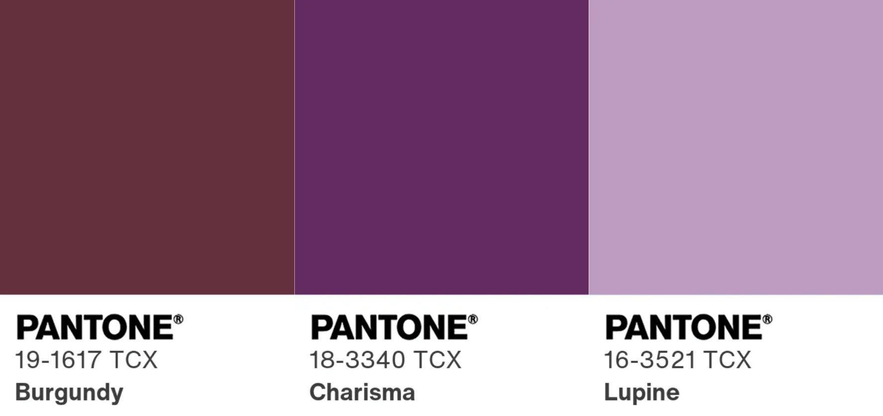
Don’t Count Out Plum Purple, Earthy Aubergine or Wine Red
While Gilbert guessed muted olive, she wouldn’t be surprised if the color of the year ended up being a deep plum.
“Rich jewel tones feel rooted in heritage; they’re often associated with high-quality, handcrafted objects like ornate tapestries and upholstery,” she said.
If not plum, Associate Creative Director Amy Scaggs predicts Pantone might decide for the first time to go for a dark, blackened purple like an earthy aubergine for a mix of cozy comfort, drama and organic warmth.
“Walking High Point Market this year, I loved seeing showrooms push past safe neutrals and lean into saturated, cocooning colors with real depth,” Scaggs said. “While people usually think of green when it comes to bringing nature indoors, the organic world also gives us gorgeous, moody tones like rich soil, dark florals and deep late-harvest fruit.”
Similarly, burgundy was the choice for both Digital Designer Laurel Welch and Senior Designer Erin Doerflinger.
“Basing that on nothing other than the fact that I keep seeing this color everywhere in interiors, etc, and the last two years were white and mocha, so I’m thinking they will bring color back in, but keep it classic,” said Doerflinger.
And If Things Get Really Wild
Digital Designer Josh Blackwelder has his fingers crossed for Dragon Fire (16-1460 TCX) as this year’s selection. He may be biased as it is close to Wray Ward’s orange.
In the same vein, Design Director Brandon Scharr said a color such as Dragon Fire would work as a “find-my-body-orange,” and would be perfect for occasional snowboarders such as himself.
And as “an avid, but clumsy gamer,” he said he’s a proponent of “‘Where'd I drop my stuff yellow’ because I always hit the wrong button and have to go back to find amongst the detritus, so I need something to help me find it.”
For her guess, Designer Caroline Bounds picked a Pantone choice that doesn’t actually exist but is based on the results of the 2026 elections.
“I anticipate that the color of the year will be ‘Blue Wave,’” she said. “The people have spoken!”
Who will be right? Stayed tuned for our take on Pantone’s official unveiling in early December.