Creative
Industry Trends

Written By
Caitlin License
Associate Creative Director
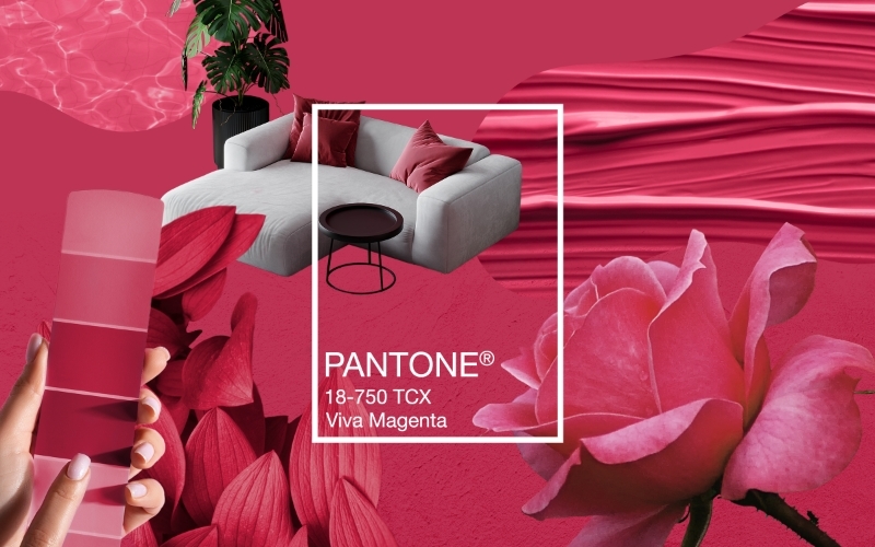
I’ll be honest. When I first saw that Pantone had named Cloud Dancer the 2026 Color of the Year, I was pretty surprised. Whereas in previous years Pantone has often chosen bold, expressive hues that almost demand to be seen — such as 2023’s Viva Magenta — a quiet white felt unexpected.
The more time I spent with it, though, the more it settled into my mind in a way that felt refreshing. Almost like realizing the beauty of a simple garment in your closet that you can wear a hundred ways. A capsule color that stays relevant long after the season has passed.
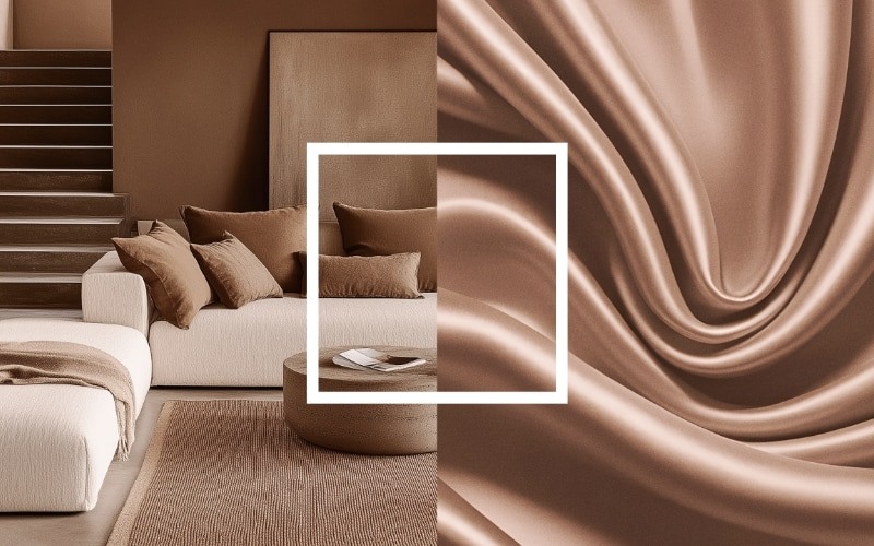
In my own home and wardrobe, I have always gravitated toward neutrals because they create space for expression rather than overwhelming it. With Pantone’s 2025 Color of the Year, Mocha Mousse, we saw a shift toward comfort and earthy elegance. Cloud Dancer works in that same spirit. It carries a calm, airy presence, showing that simplicity can feel full and meaningful.
A Shift Toward Collected, Character-Rich Spaces
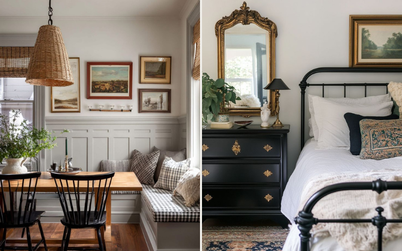
What makes this moment especially interesting is how closely the color aligns with the direction interior spaces are already moving. There is a real movement away from the curated, picture-perfect rooms of years past. People want spaces that feel collected rather than decorated: homes filled with handmade pieces that carry meaning, thrifted finds and family items that work together to create spaces full of warmth and character.
Cloud Dancer supports that shift by offering a neutral base that lets those stories shine. It becomes a quiet canvas that welcomes pattern, texture and personal expression without competing against them. This soft shade of white also pairs effortlessly with natural elements such as clay, plants, wood and stone. It works beautifully alongside light ceramics, natural fibers and materials that lean into imperfection rather than precision.
A Color That Reflects the Cultural Mood
Pantone’s selection of Cloud Dancer taps into a feeling many people share: a growing desire to step back from the relentless pace of life, to disconnect mentally and find a sense of balance and clarity.
Cloud Dancer symbolizes a fresh beginning, an invitation to simplify and a quiet place where ideas can take shape.
I see this reflected in what clients and consumers are asking for as well. People want homes that support well-being, rest and moments of pause. They want spaces that feel real rather than staged, comfortable rather than perfect. Honest materials, soft textures and meaningful pieces are becoming far more important than creating a room that looks ready for a photograph.
Why It Matters for Designers
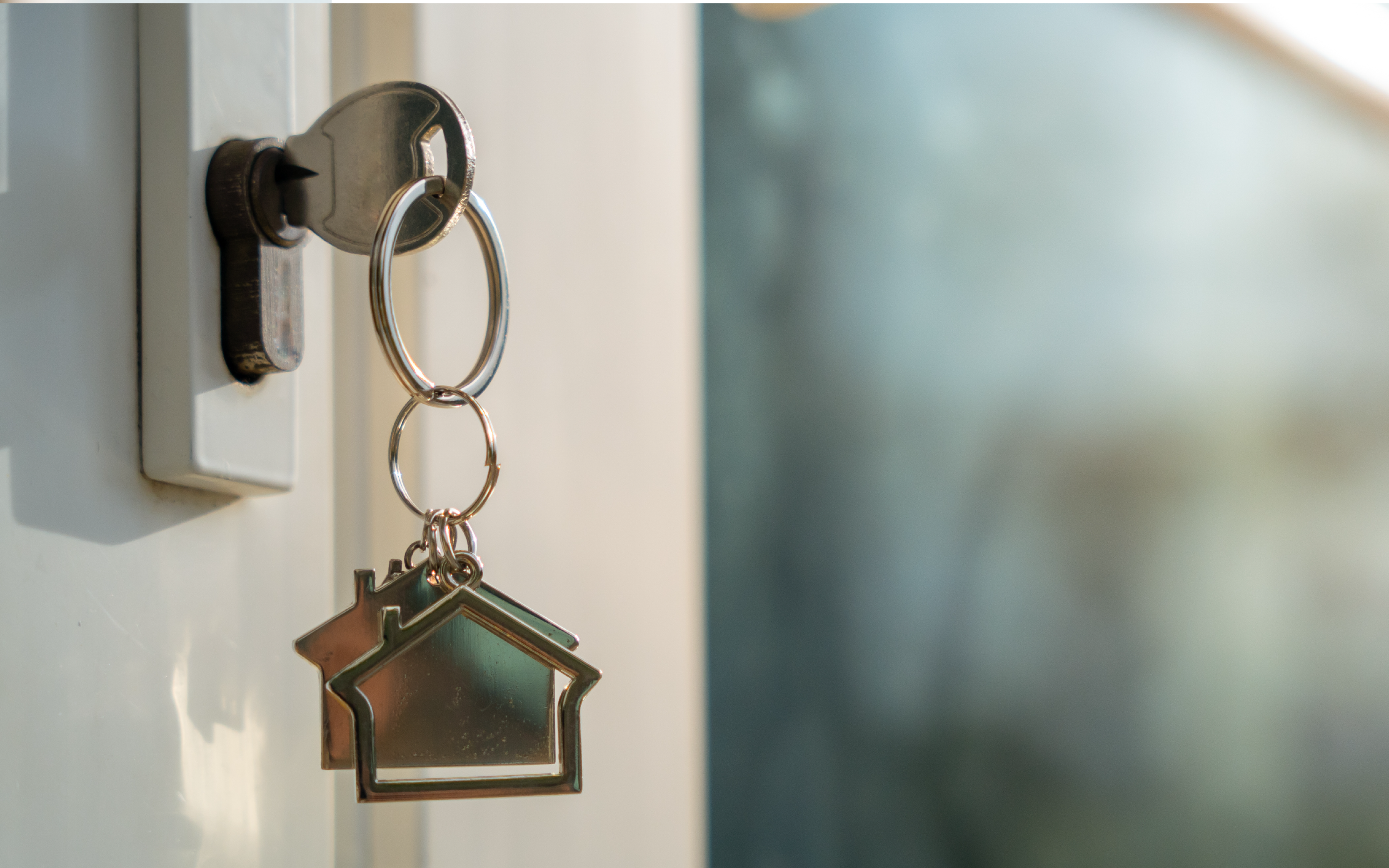
Pantone’s selection of a structural color like white is more than a trend — it’s a cue to design with intention. It gives room to experiment with texture, vintage or collected pieces, and biophilic details that move away from excess toward spaces that feel purposeful and lived-in. It also aligns with the growing focus on sustainable materials and natural, human-centered design.
For designers, it’s an opportunity to craft environments that are both thoughtful and inviting, helping people feel grounded in their homes as they navigate a fast-paced, digital world.
For me, that makes Cloud Dancer an exciting choice for 2026. It may not be the boldest color Pantone has ever chosen, but it feels meaningful — a versatile shade that can both harmonize and create contrast. It invites us to slow down, look closely and build spaces with care and intention, where every piece has a story and every texture adds character.