Marketing Insights
Thinking about altering your logo? Evolving or replacing a brand identity is not something to be taken lightly.
“The single largest source of intangible value in a company is its trademark,” says David Haigh of Brand Finance, a brand-valuation consultancy. Wall Street values Google’s trademarked look at $44 billion, which is why it took Google two years to update its logo in 2013, and also why you may not have noticed (the Google logo got a refined color palette and tweaked letter shapes).
If Google is that careful, you should be, too. Here are four good reasons to adapt your brand identity.
1. The business has changed.
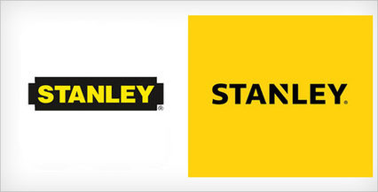
When Stanley acquired Black & Decker in 2010, it identified a need to reposition the company and the brand.
The Stanley brand needed to retain its strength in tools while setting up the company to operate in a wider range of industries like health care, security, engineered fasteners and oil pipeline services. It also needed a logo that could support its new positioning line, “Performance in Action,” a move away from the DIY-er focused “Make Something Great” in favor of wide appeal.
2. The marketplace has changed (a lot).
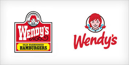
When Wendy’s started using its familiar logo in 1983, it focused on the “realness” of its burgers. Since then, the market has changed, and the “new Wendy’s” promotes a broader line of non-burger products. Internal and external changes created a need to take the “old-fashioned” out of Wendy’s while retaining redheaded Wendy.
3. You’ve reached a milestone and need some attention.
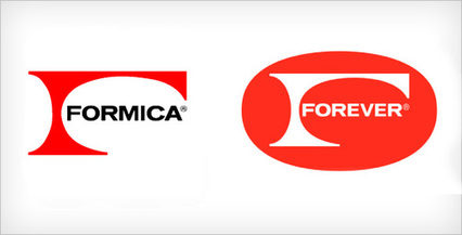
Did you know that Formica, the laminated plastic countertop of kitchens everywhere, is 100 years old? Nobody else does, either. Formica wanted to call attention to its anniversary while making kitchen designers and consumers take note of its new, retro-cool designs.
The company didn’t so much redesign its logo as play with it, building a year-long celebration called “Formica Forever” around the modified mark. The Formica Forever celebration included a delightful graphics and video campaign and website around the history of the brand; designers even received a keepsake retro wall clock that incorporated the new products.
4. You need to put something behind you.
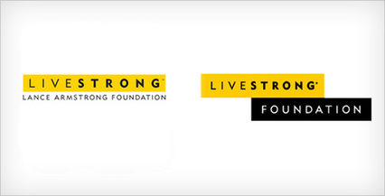
Livestrong, with its iconic yellow wristband, has served 2.5 million people affected by cancer while raising $500 million to support cancer survivors. A well-managed organization that cut ties with Lance Armstrong following his downfall, it needed to begin what will be a long, restorative process to disentangle the brand from its founder.
As part of a long-term, multi-channel effort, Livestrong adapted its brand identity in a way that retains its distinctive look and feel.
Each of these four organizations considered how its brand connected with its marketplace and customers and created a thoughtful and comprehensive response supported with coordinated communications and good timing – the right way to change a logo.
In my next post, I’ll explore two terrible-but-all-too-common reasons companies change logos.
What other organizations have caught your attention by changing their brand identities? Let us know in the comments.