Creative
Have you ever wondered why green is used in night vision goggles? It’s because our eyes are more sensitive to green and see more shades of green than any other color.
In 1929, the U.S. Bureau of Engraving and Printing decided to use green ink for paper notes, because green could better withstand chemical and physical changes than some other colors.
Green is also the world’s second favorite color after blue. And this year, the Pantone Color Institute chose Greenery as its Color of the Year.
Greenery is a fresh and zesty yellow-green that evokes the first days of spring when nature’s greens revive, restore and renew. Illustrative of flourishing foliage and the lushness of the great outdoors, the fortifying attributes of Greenery signals consumers to take a deep breath, oxygenate and reinvigorate.” ~Pantone Color Institute
Pantone’s choice relates to a larger movement – one that centers on returning to nature and creating serene personal spaces. And whether we realize it or not, design trends are a reflection or result of what’s happening in the world.
Understanding color psychology
Colors are a form of nonverbal communication, and they speak volumes. They influence emotions. They make us think. In fact, more than 80 percent of people choose a product based on color. And as marketers, we should pay careful attention to the colors we use. If we manage color effectively, we can influence consumer emotions and purchase behaviors.
There are four psychological primary colors:
- Red – body
- Yellow – emotion
- Blue – mind
- Green – harmony
It’s important to be aware of the multiple meanings of colors and how they could affect consumers in certain situations. For example, green is fresh, positive and healthy. It boosts creativity and is calming, optimistic and confident. It is also representative of luck and liveliness. But while green has many positive associations, it is also sometimes connected with negative thoughts and feelings including greed, envy and jealousy.
Accepting the challenge
Green can be a happy color. That’s great! But remember, it’s possible to have too much of a good thing.
People today – even those in urban settings – crave a closer connection to the outdoors. And I’m sure palettes featuring Greenery’s trans-seasonal shade will start popping up in many product categories – from fashion and beauty to home and garden – in the coming months.
But bringing Greenery indoors can be a hefty task for designers. Don’t go overboard on Greenery; doing so can make people feel slow, lazy or lethargic. Instead, use it sparingly as a pop of color in accessories or accent furniture or on a small wall. Moderation is key.
Pulling off Greenery in a sophisticated way is no easy task. Here is just one example of color pairing suggestions from Pantone:

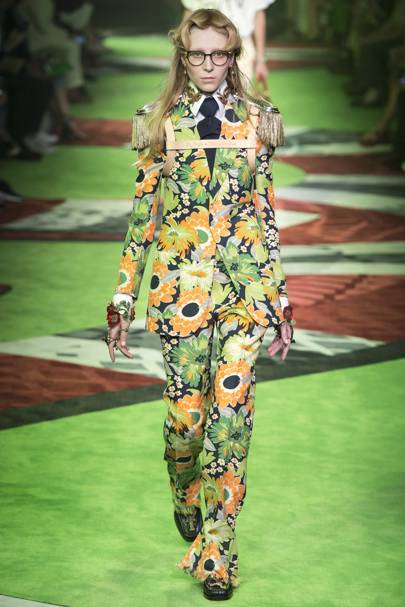
Greenery is already making a splash.
At the Gucci Spring/Summer 2017 show, many models wore clothes in the Greenery color while walking down a Greenery-colored runway.
Sephora introduced Make Up For Ever Eye shadow in Lime.

The 2016 Paris Motor Show featured this Mercedes-AMG GT R.
Differentiating yourself
While Pantone has tremendous authority in the color and design world, don’t make the jump unless you can stick the landing. If it doesn’t make sense for your brand, resist the urge to force it in the name of a trend. Remember, the Pantone Color of the Year is simply a symbol of human culture and society’s general mood. As with anything, brands that try to force it will fail.
Pantone says “Greenery is nature’s neutral.” This makes sense; green is the most common color in the natural world.
Since green is so closely associated with being eco-friendly or organic, brands that don’t have those qualities may find the color difficult to incorporate. Granted, some brands like Kate Spade have been successful using green shades in creative ways, but they are the exception, not the rule.
Stay true to your brand and the stories that make it unique, and tell those stories in a way that will resonate with your target audience. Do that well, and you’ll set yourself up for marketing success – no matter how large or small of a role you give the Pantone Color of the Year.
You might also be interested in:
Pantone Colors of the Year: Rose Quartz and Serenity